Exhibition
The world is your gallery
Overview
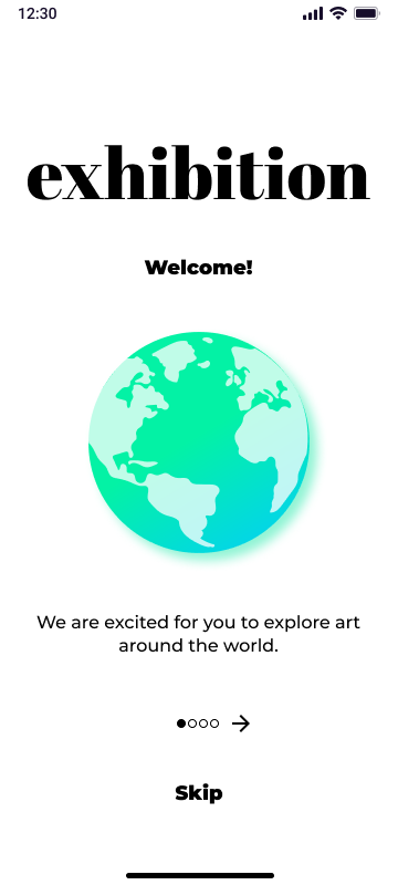
The Exhibition app was a personal project of mine. Exhibition is about tearing down the high-falutin walls of the modern art gallery. While many galleries currently have some sort of companion app, many don't serve the user very well due to inconsistent upkeep, bad UX, or bare-bones information. As a passion project, I set out to solve how we might bring art around the world to art lovers and artists.
The Problem
After interviewing several potential users, I discovered that the majority of them feel frustrated with the current technology used to aid gallery and museum visitors. Visitors are finding that companion apps either take up unnecessary space on their phone, are laggy, or are hard to use and navigate. These initial findings began to unfold the overall goals for the app. What if we could create something that not only enhances a gallery visitors experience but also drives them explore more galleries than they ever could?
Goals

User
Get lots of gallery/museum info and save art pieces

User
Easily navigate and explore art around the world from the comfort of home

Business
Create a platform that exhibits around the world will want to opt into
Learn
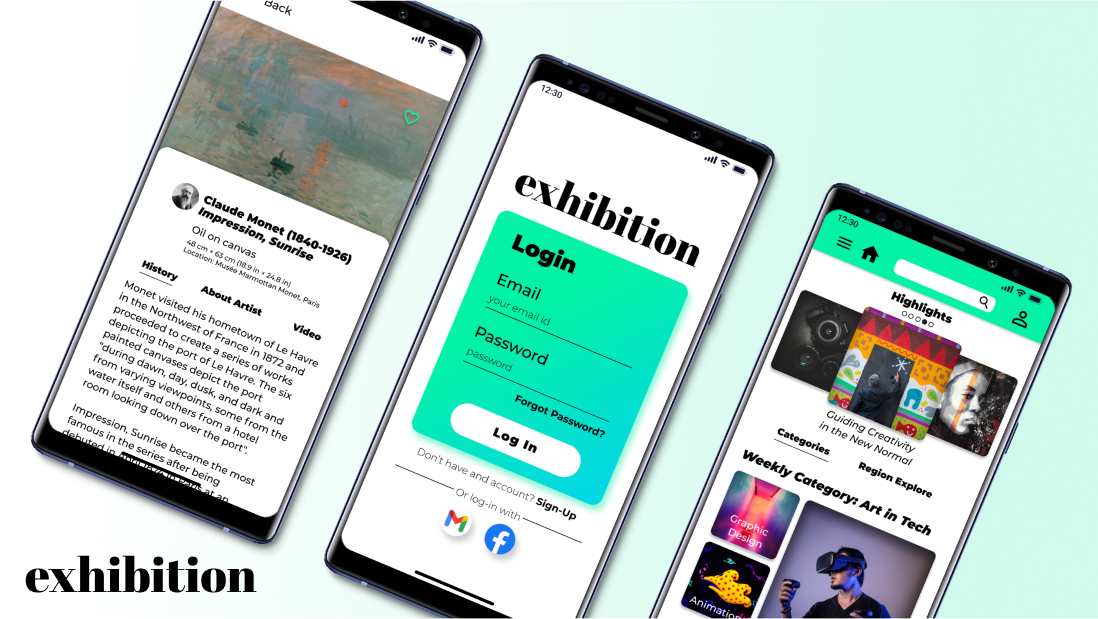
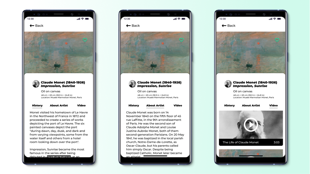
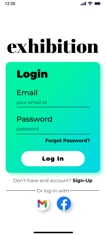
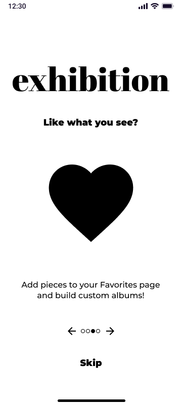
Exhibition allows users to learn about various art pieces, its history, and watch videos to gain more information. Users can favorite different works and create custom albums for later viewing and research.
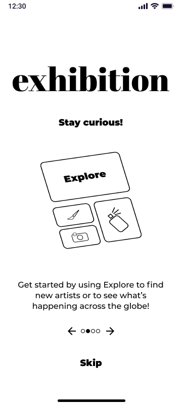
Explore
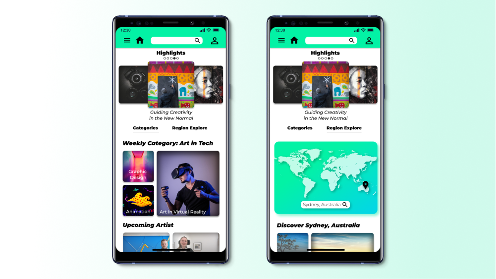
There are a number of users who also face the challenge of physically visiting art museums around the world due to different abilities physically and/or financially. This inspired the Explore feature within the app where art lovers can discover artists around the world by rotating categories as well as by Region Explore.
Research
I organized three user research sessions, which included one for user interviews, and two for usability tests. Market research via a competitive audit was also conducted. After establishing the user pain points, I created several personas and user stories that informed my lo-fi and hi-fi prototypes.
Pain Points
I surveyed over 40 people (ages 18-65) who visit art galleries/museums 1-10+ times a year. I chose to interview 5 different participants based on how often they use tech to aid their gallery visits.

Product
Poor product design with most gallery apps: Lack of visual quality in design

Process
Overall bad user experience: App is clunky and hard to navigate

Support
Outdated and lacking support: Most companion apps are not kept up-to-date
User Stories
After identifying the key user pain points, I was able to pin down two types of users that I would be designing for, Li-Chia, the artist, and Ryu, the average art appreciator.

Li-Chia Middle School Teacher

Ryu Mechanical Engineer
Usability Studies
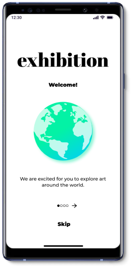
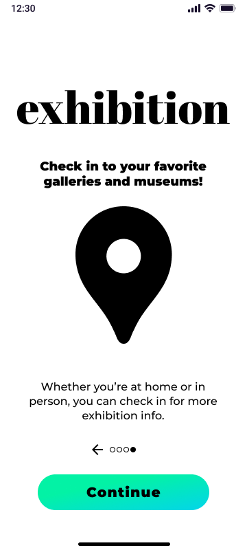
For both rounds of the usability tests five participants were asked to complete different tasks that focused on the main user journey. They were also asked to complete a usability scale. Affinity maps were used to establish common themes and specific insights. From the first round of testing, users wanted more clarity about the app functionality, better album management, and more interactive features. Users were excite about the potential for album management and a bit more interactive features. These opportunities that I felt could easily be addressed. However, clarity about app functionality took several iterations from onboarding videos, checklists, to tooltips. To address certain confusion about the app’s functionality, I created an additional onboarding page that explains how Exhibition can be used. The next usability study informed me that the feature was a success. Users were able to understand what the app was all about without any explanation from me as the conductor of the study.
Visual Design
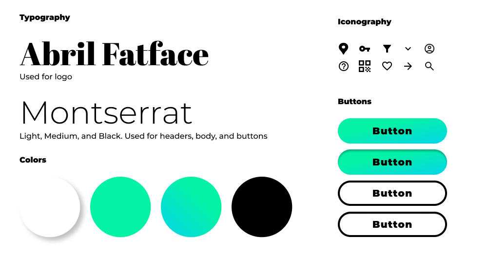
My approach to the visual design was to keep the attention on the art and the artists featured within the app. From my research, many users had somewhat negative connotations associated with galleries. Such users think of galleries as being gatekeeping or divisive. These negative views informed a welcoming and cool color pallet to challenge those perceptions and tell a more inclusive story.
The Results
In the end users were excited about the final product. People found the app extremely easy to navigate and many of the users stated they would love for this app to be developed so they could use it.
100%
of users found the app easy to navigate (60% more than the first study)
100%
of users said they would use the app while at a gallery/museum
80%
of users said they would use the app while at home
"All of these museums in the same app? That would be so handy!" - Joshua A.
If I were to continue designing this app for actual development I would continue working on more collaborative and interactive features. Additionally, I would work more with individual gallery owners to see how we could create the best user experience for them while they create and manage their individual exhibit pages. I would recommend tracking the number of active users, and galleries utilizing Exhibition for their own showings.