stephen oey

Dragonfly
Type
Web App
Role
Lead Product Designer
Year
2022
Overview
Dragonfly helps job seekers stay on track and strategize their hunt.
Dragonfly was created as a proof of concept during an 8-week design sprint. I collaborated with a product manager and two engineers as lead product designer, responsible for research, prototyping, testing, and designing the full experience.
The result: a web dashboard and browser extension that helps users organize their applications, track performance, and stay motivated throughout their search. Dragonfly centralizes scattered information from multiple job boards into one simple, visual system — giving users clarity and confidence in an otherwise chaotic process
Video:
Auto Populating The Web Extension

Image:
Job Application Card
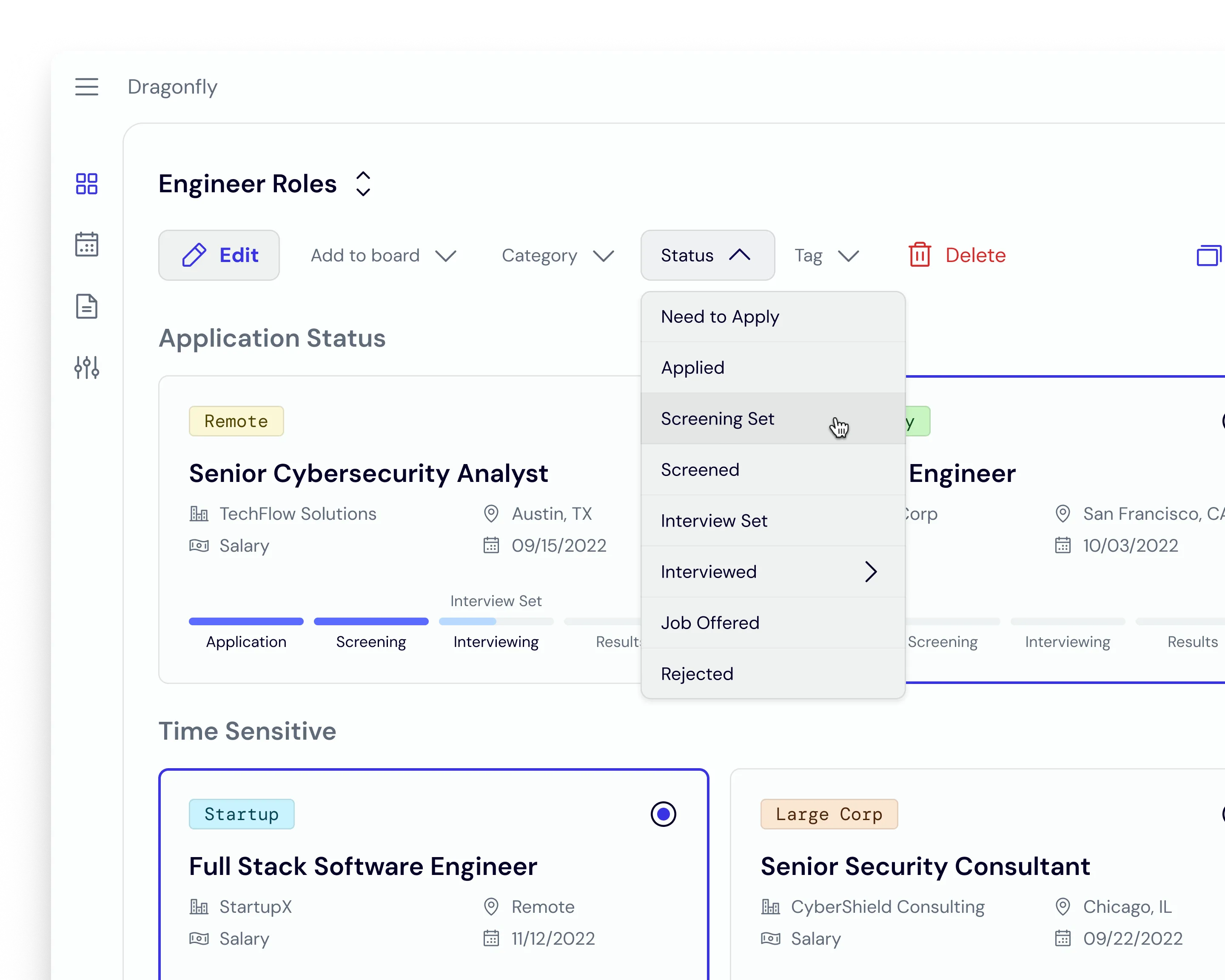
Image:
Card View Edit Mode
Problem
Applicants are submitting dozens of applications across multiple platforms, losing visibility into their overall progress.
- 21–80 applications are typically needed to land one offer (Zippia, 2021).
- 94% of users apply through multiple job boards.
- 78% already use tools like spreadsheets to stay organized — but most abandon them due to high upkeep.
This revealed a clear opportunity: a single, easy-to-maintain system that centralizes applications and tracks performance automatically.

Image:
Resume Performance Stats
Research
User interviews and early testing highlighted a consistent theme — overwhelm.
Most users relied on spreadsheets or docs to log their applications, but the process quickly became tedious and unsustainable.
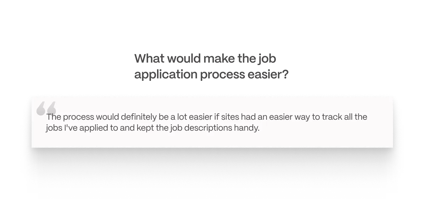
Image:
User Interview Quote

Image:
Initial Dashboard Sketches
Execution
Insights driven by research led to a dashboard-central design that balances visibility and control.
Dragonfly consolidates job data into clear visual models, helping users spot trends and strategize next steps in their search.
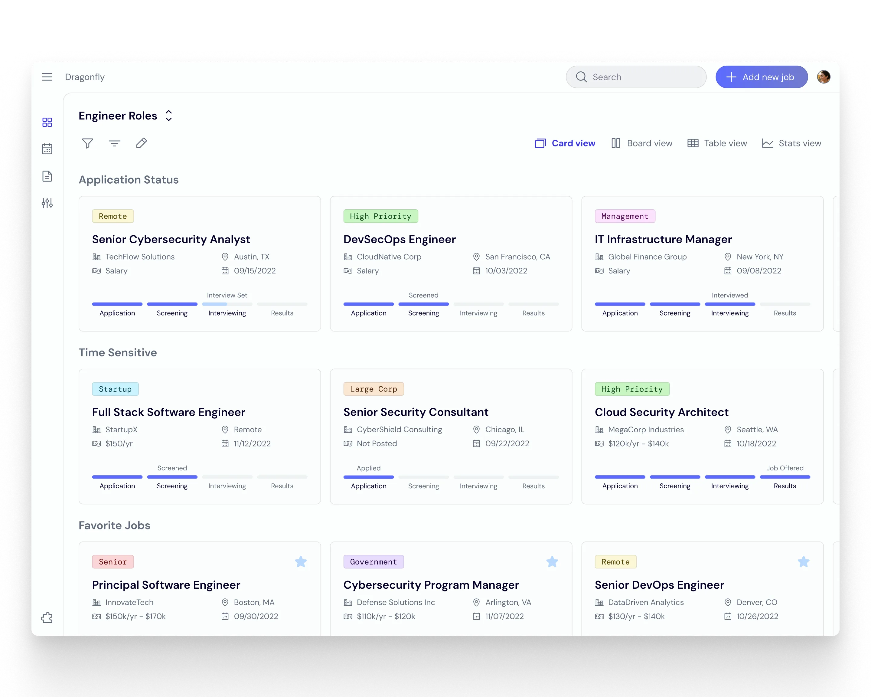
Image:
Card View
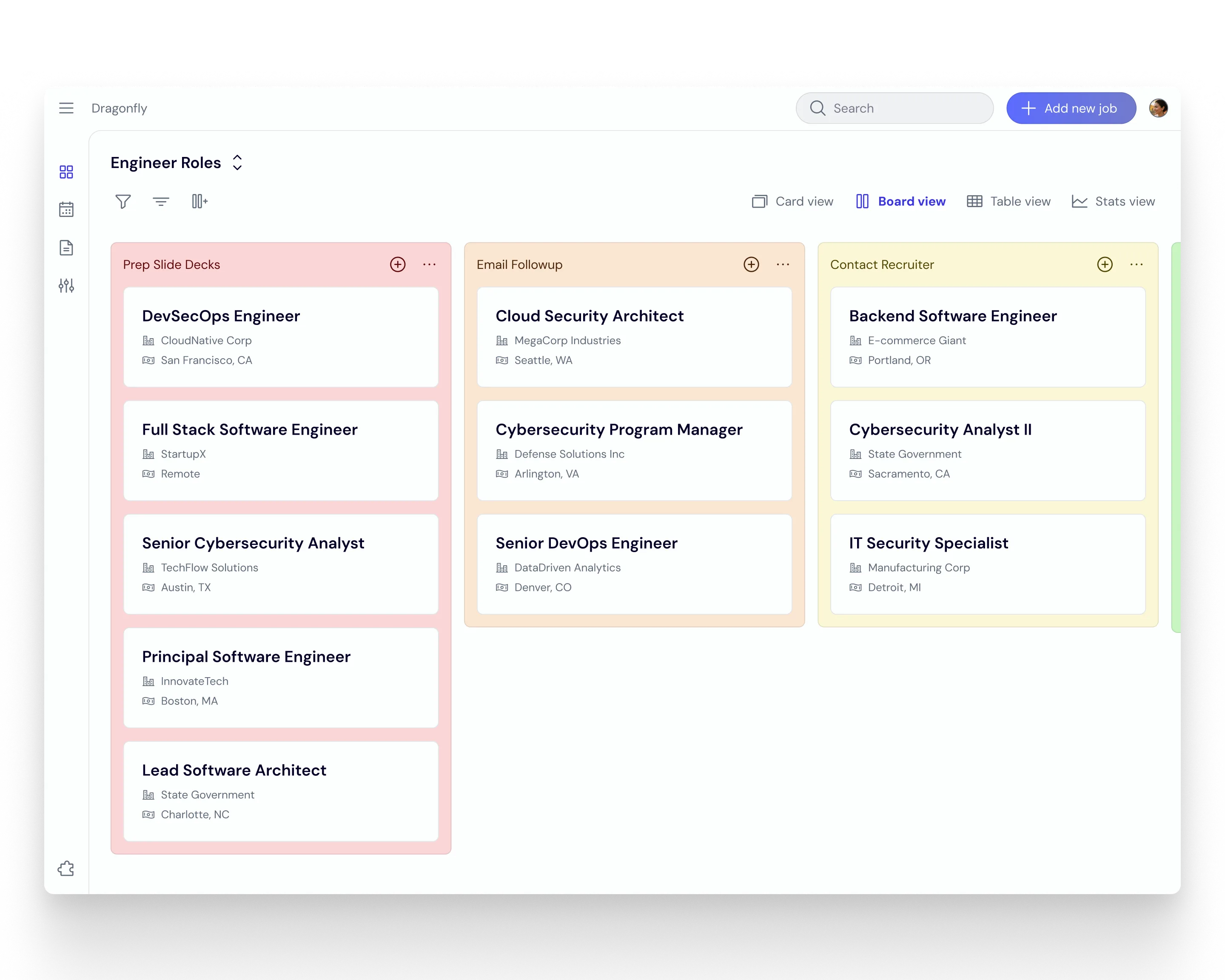
Image:
Board View
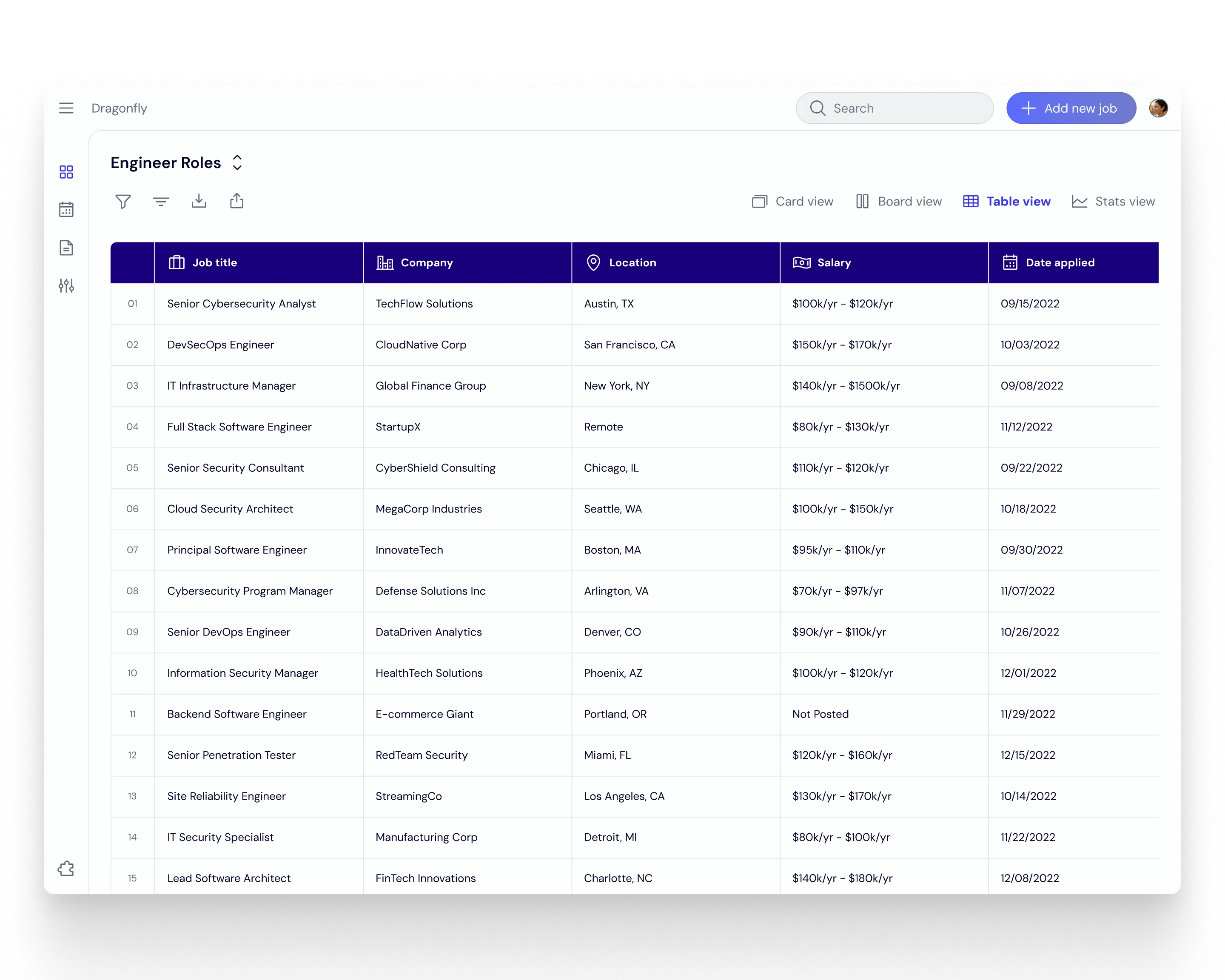
Image:
Table View
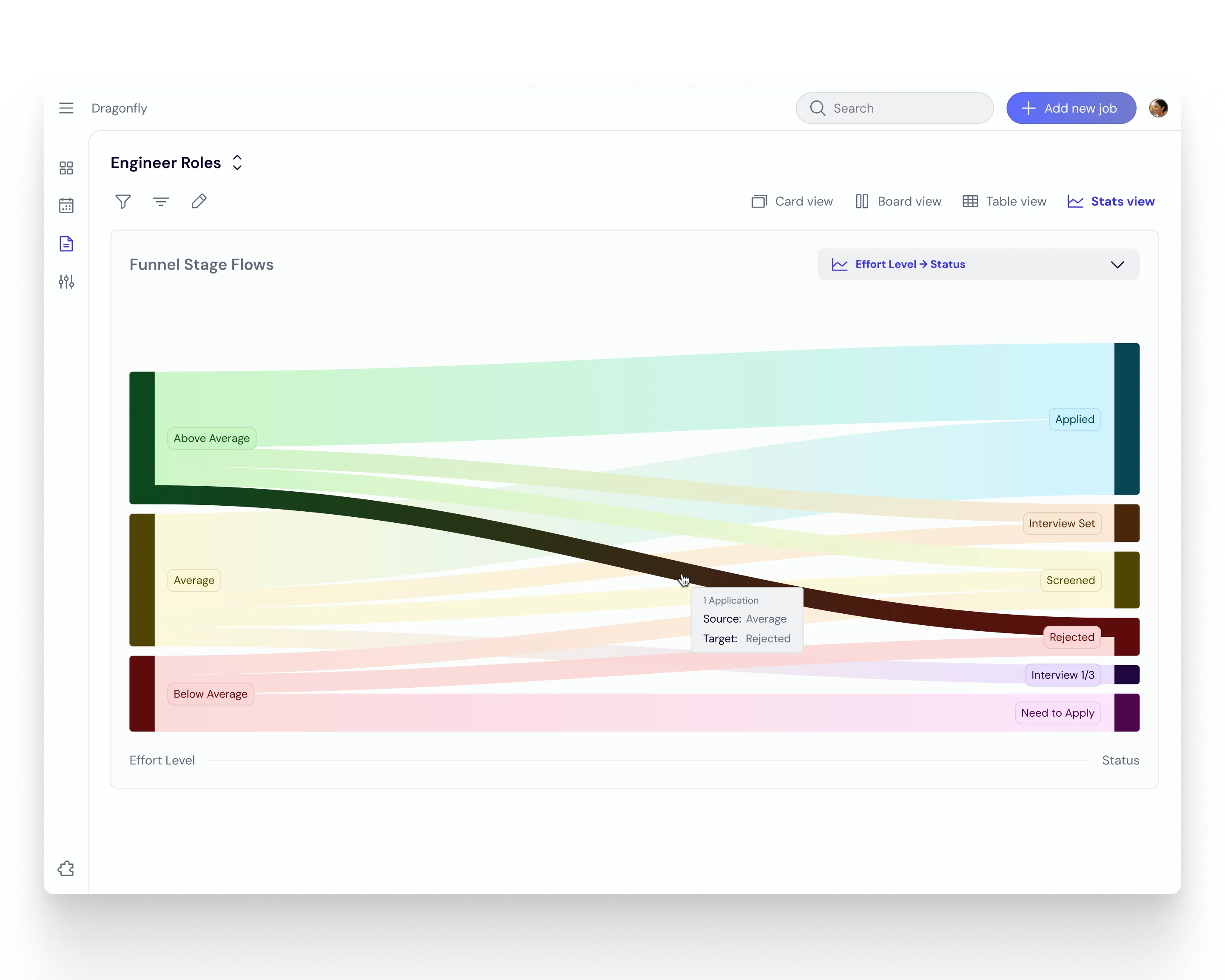
Image:
Stats View
Impact
A strong signal of early adoption potential.
User feedback was overwhelmingly positive. Despite being an MVP, we received multiple requests to keep the service live.
Reduction in Friction
We saw an 80% reduction in friction for adding jobs to custom boards after redesigned and tested the Board View flow with users.
High User Interest
New users showed great interest in automated job capture through the browser extension concept as well as data visualization features.
Scalable Growth
With a backlog of future opportunities identified around Stats View, Reminders, and Resume Libraries, Dragonfly had tested features for a fuller ecosystem.
End Note
Dragonfly was a reminder of how much value clarity and collaboration bring under tight constraints.
The project surfaced technical challenges that required creative compromise, and our small team handled them with agility and grace, delivering a foundation strong enough to spark real user enthusiasm.